07. Tiko
Making solar energy at home simple to manage
A smart home app that connects devices across every area of the house, so families can use their solar electricity wisely, stay comfortable and spend less.
- Client
- Tiko
- Role
- UX/UI Designer at MOXY
- Sector
- Smart home · Energy
- Year
- 2018

Impact at a glance
01. Context
Tiko brings the power of a Virtual Power Plant and smart home energy management into people's homes. Connected devices manage heating and the solar electricity produced on site, across multiple devices and rooms.
02. The problem
Energy management felt technical. Devices, areas and settings were spread across a complex hierarchy, so people didn't know how to control their home or how to save.
Business goal
Grow an engaged base of homes whose devices can be balanced as one virtual power plant.
Customer goal
“Keep my home comfortable and lower my bills, without becoming an energy expert.”
03. Insights
- 01
People think in rooms and routines, not in devices and kilowatts.
- 02
Comfort is the motivation. Saving energy is the reward that keeps them engaged.
- 03
A long manual configuration was the main reason homes never got fully set up.
04. Strategy
Simplify
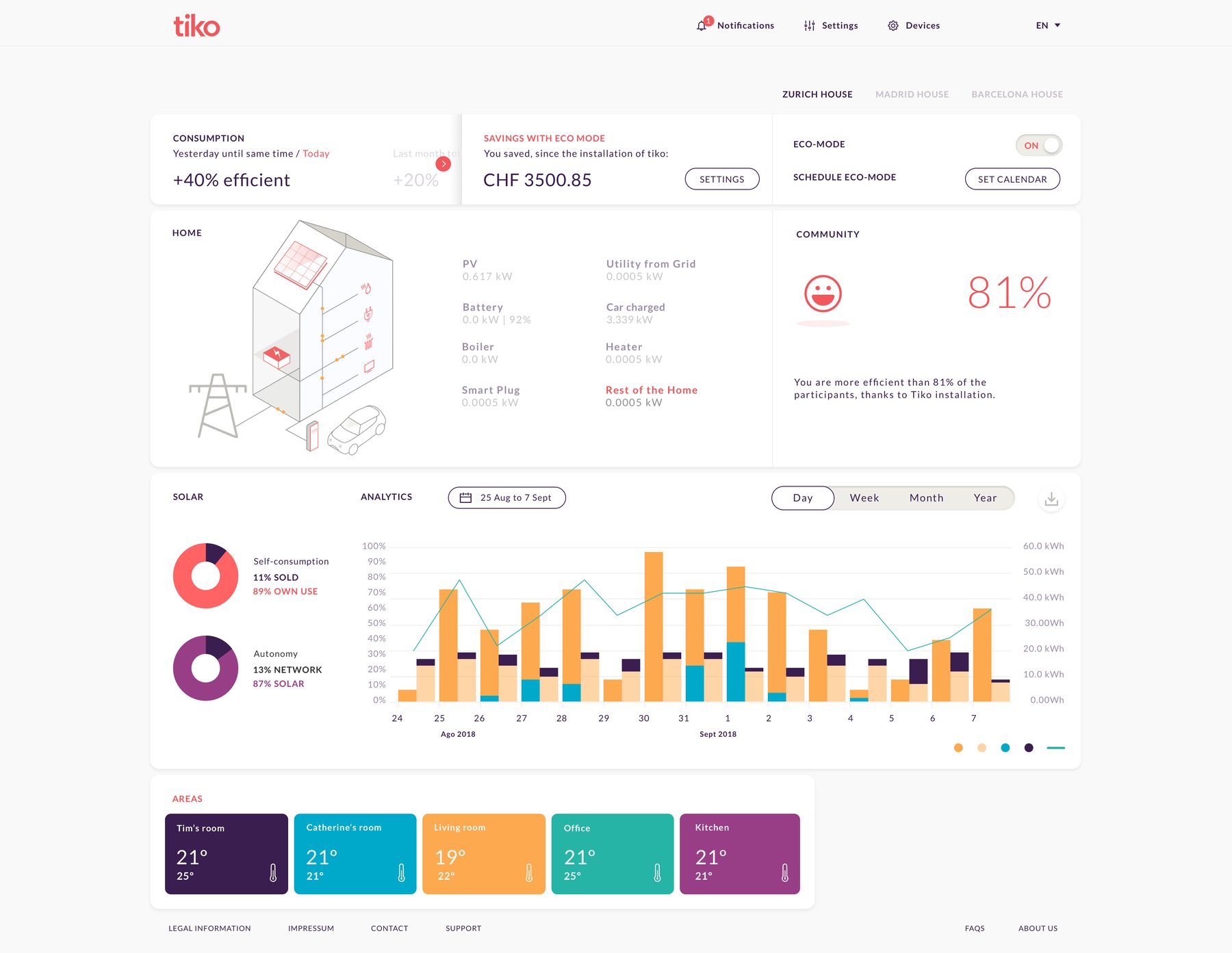
Redesigned the hierarchy around the home: areas first, then the devices inside them.
Personalise
A quick quiz about habits and routines, so the app adapts temperature and energy use automatically.
Control
Decentralised, remote management per area, so comfort is ready before you arrive and paused when you leave.


05. Key decisions
Organise by area, not by device
Trade-offMore mapping work behind the scenes, much clearer control for families.
A quiz instead of manual configuration
Trade-offLess fine tuning at first, far more homes completing setup.
A friendly icon language for energy
Trade-offA custom icon set to build and maintain, but technical concepts became readable at a glance.
Two depths of the same story
Trade-offThe phone keeps quick comfort control, while the desktop carries the wider overview, the savings and the dashboard of every area.
06. Outcome
A simple, easy to use app with a new hierarchy and visual language, helping households manage and economise their home efficiently while supporting the wider energy network.
What I learned
“Sustainability gets adopted when it feels like comfort, not like effort.”
Next case
A store assistant on the wrist